Visualize Uncertainty
NYU Abu Dhabi Design Lab Summer 2017
Modern data visualization can give people false impressions of preciseness when data are subject to some uncertainty. This summer research project aims to test and compare different interfaces that represent uncertainty in randomly generated data following user-specified distribution and parameters.
The research project utilizes html, css and javascript, complemented by Angularjs and d3 library. It is part of a bigger project at NYU Abu Dhabi Design Lab.
Why do we need to visualize uncertainty in randomly generated data?
For instance, if a hospital revamps its database and wants to test it, the hospital cannot risk using real data because of potential failures and security leaks. The hospital can use randomly generated data with some specifications: age, gender ratio, etc. The hospital can input requirements/specifications into a data generator and use the randomly generated data to test new system. However, the problem is that no algorithm can produce exact result. If the hospital specifies a mean age of 50 in 1000 generated data points, the generated results may yeild 50.0005 rather than exactly 50. The current data generator service online does not incorporate the uncertainty visualization in their websites, and could give users the false impression that the randomly generated data are exact. Therefore, this research is trying to systematically visualize these uncertainties in randomly generated data.
Design
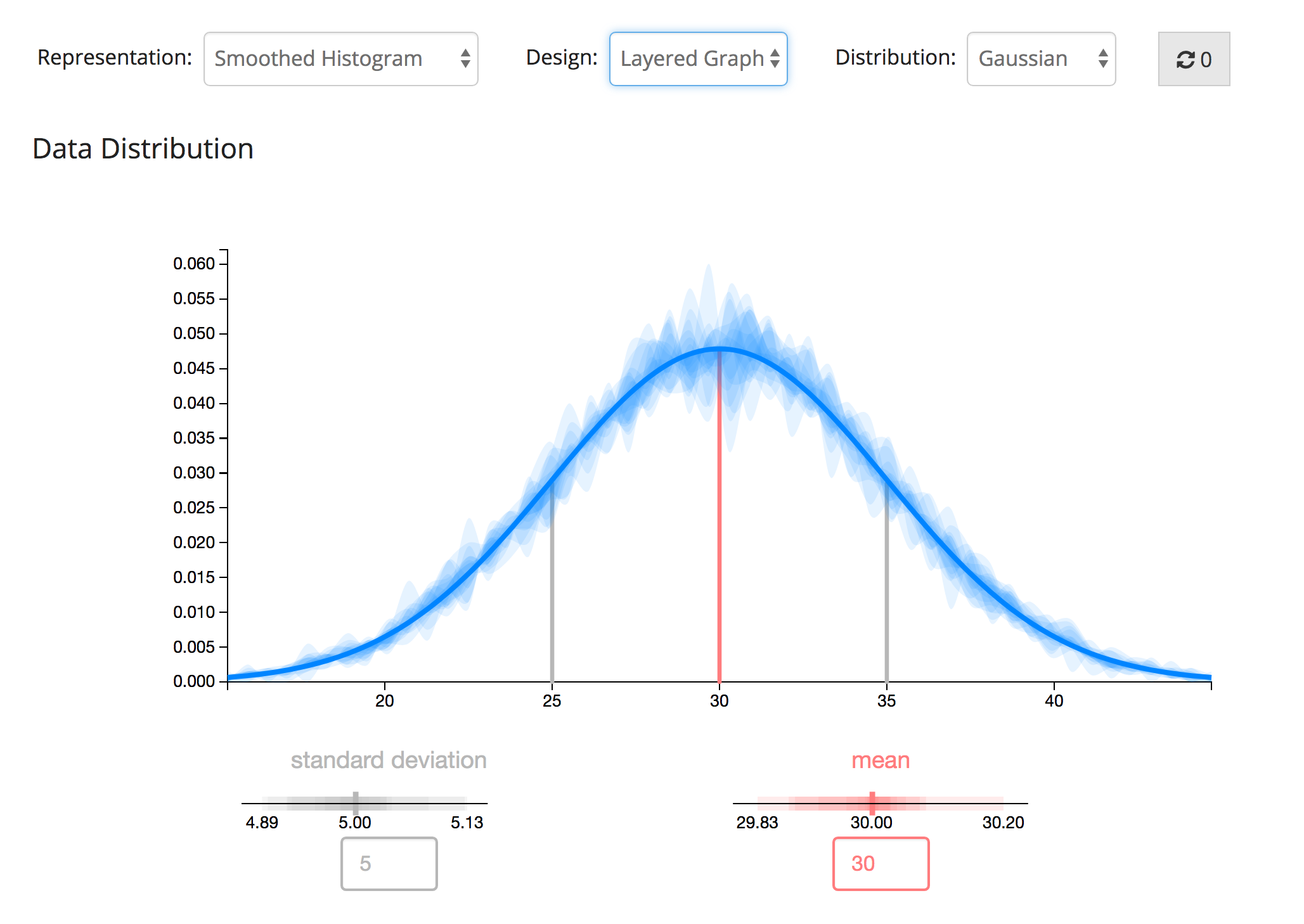
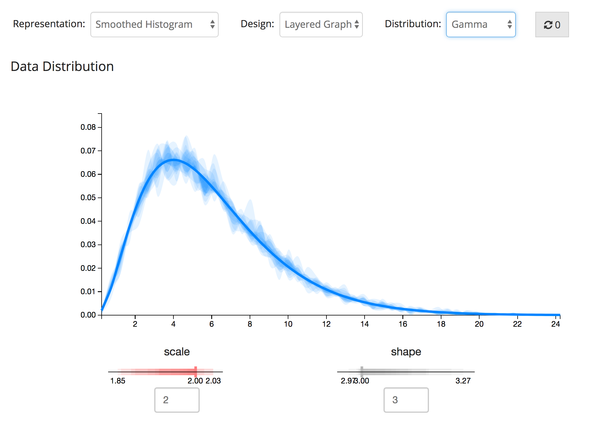
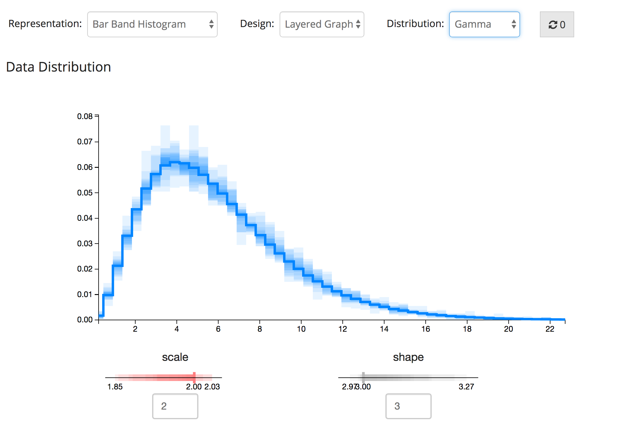
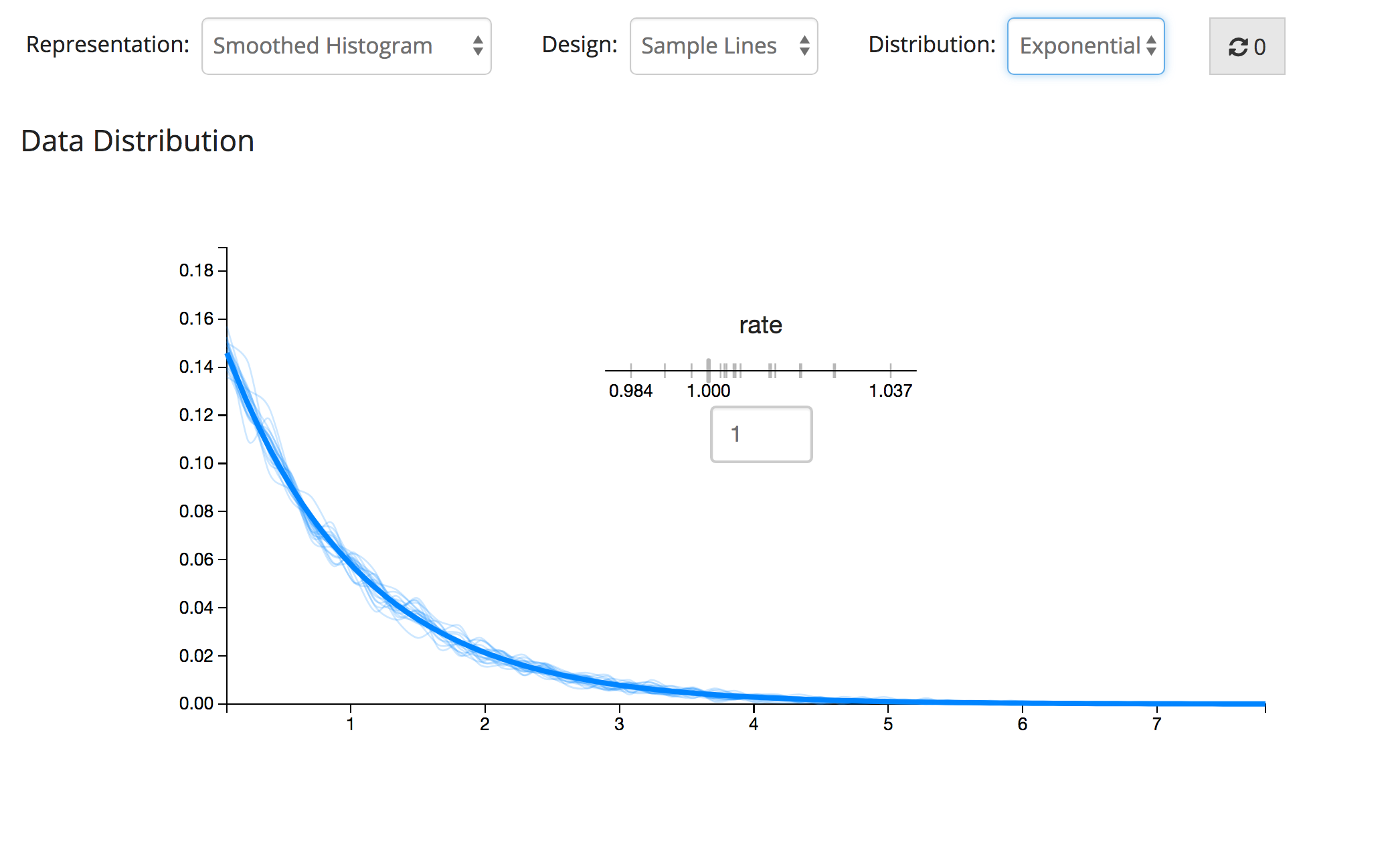
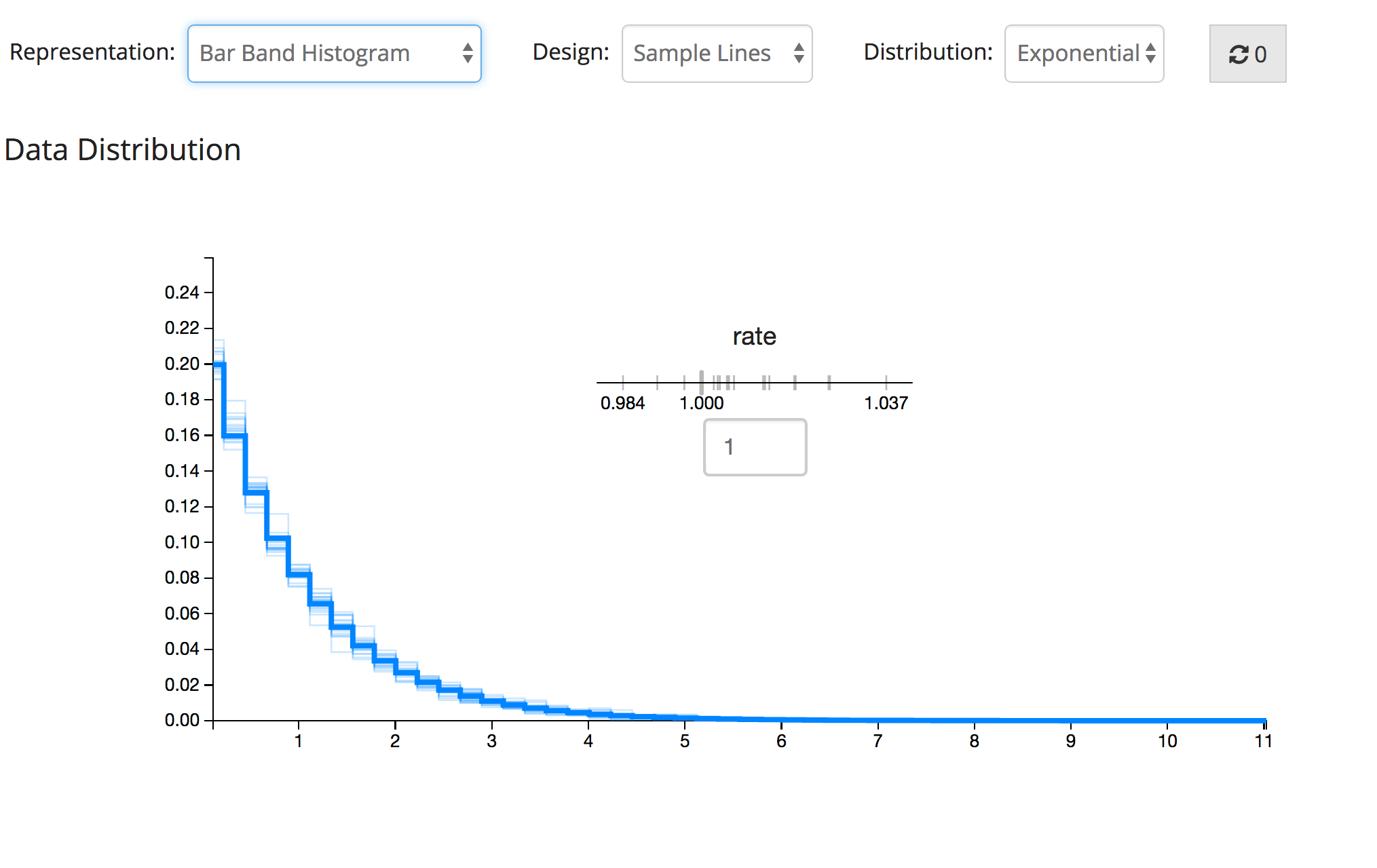
We started with 4 designs but narrowed down to 2 designs after the pilot testing. The codes of the designs are generic and applicable to different kinds of distributions. I am showing Gaussian, Exponential and Gamma distributions in this project description.
Layered Graph
The above two images are the "Layered Graph" design, and the layered areas represent the sample deviations from the theoretical distribution. The parameter representation echoes the style of the distribution distribution, with theoretical curve represented by the solid line.
Sample Lines
The below two images are the "Sample Lines" design, and the thinner lines represent every randomly generated experiment (aka: samples). The parameter representation echoes the style of the distribution distribution, with theoretical curve represented by the thicker line and samples represented by thinner lines.
Interaction with Users
Users can inspect each sample that follows a specified distribution by hovering the mouse over the thin lines (in "Sample Lines" design) or hovering over the area (in "Layered Graph" design) to look at the exact shape of the histogram. The two images below illustrates how it works.
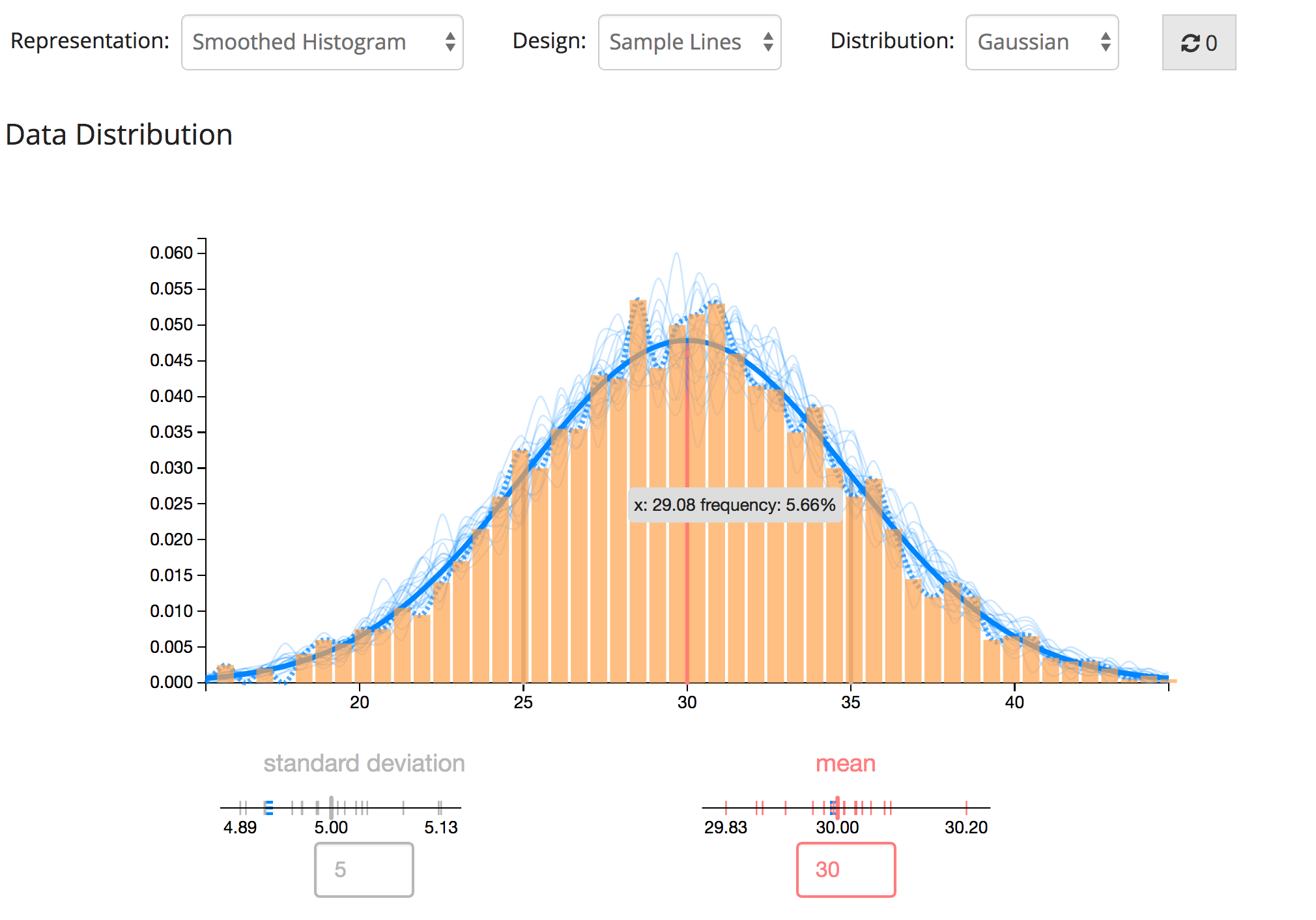
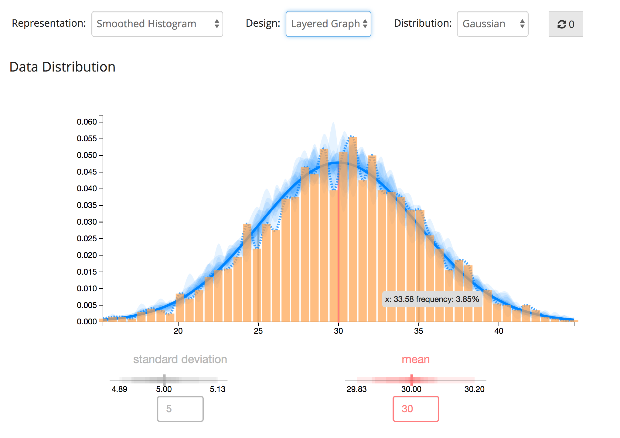
When hovering over certain sample, users are able to observe the exact distribution of that sample in both histogram and dotted line. Users are able to interact with the distribution graph and the parameter scale(s). The corresponding parameters (distribution) will be highlighted when user inspect the distribution (parameters).