A R e a
Cornell Tech on going project
A R e a, a mobile app promotes interactive experience among users, stimulates users to actively explore both the workspace and their coworker’s interests through interaction with AR. With the support of AR technology, users can inspect their workspace and learn about their coworkers’ interests while scanning the identifiers that are associated with their coworkers. The goal of this application is to assist firms and institutions to establish a fun tradition that helps new employees to know their coworkers and enhance the bonds among people who share same co-working space.
What are we creating?
Our goal is to leverage AR technology to help people better know about their coworkers and lab mates. We hope to create more social networks throughout the workspace.
Imagine as an HR manager, you want to create a quick and interactive event to mingle the newbies with the current employees every year. You not only want the newbies to be familiar with their co-workers but also the workspace. Most importantly, you want them to know who sits where. Then you download our app, which curates the interests/things about individual users and utilizes AR technology to ‘hide’ the information to 2D/3D identifiers. When users hover their phone over a scanned object, an AR information board will pop up and display relevant information about whoever this scanned identifier belong to. This mobile app is a modern way to treasure hunt “people”. The “prize” would be an ordinary identifier that would be scattered around the workspace and encapsulate personal information. The information would be revealed only when using our app, which employs AR technology to recognize identifier.
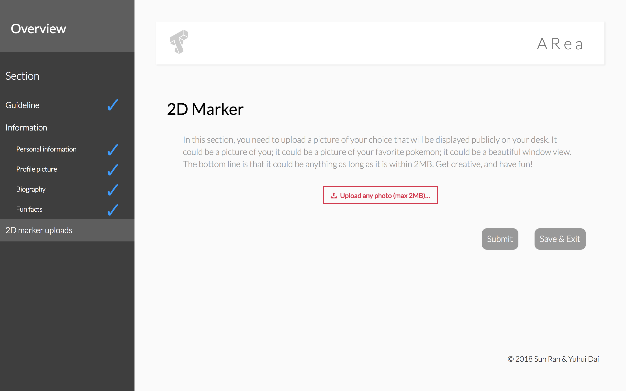
Information Collection Website Design & Implementation
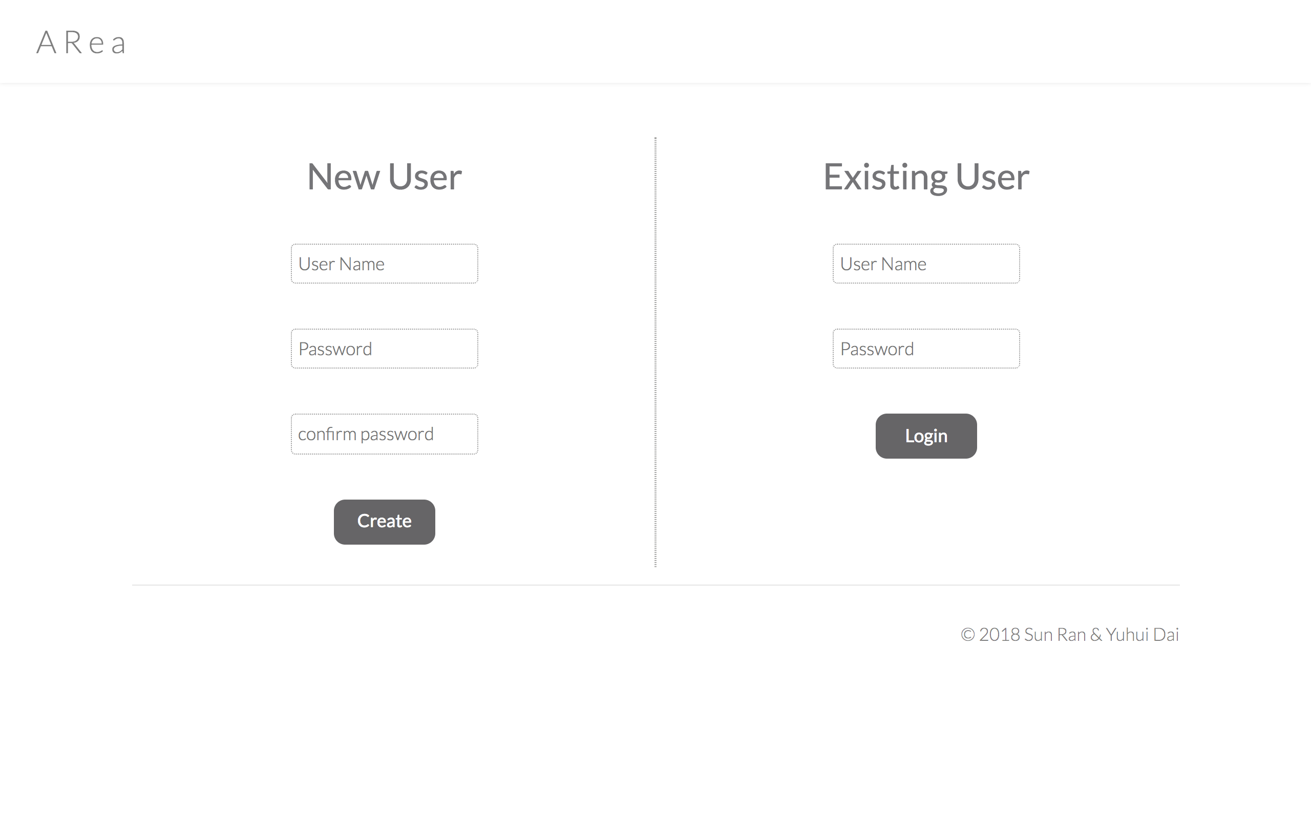
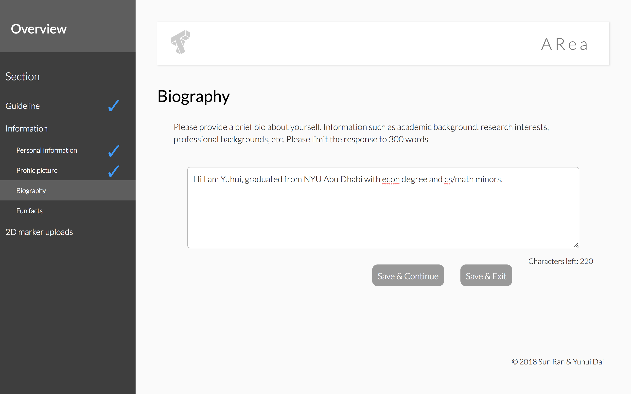
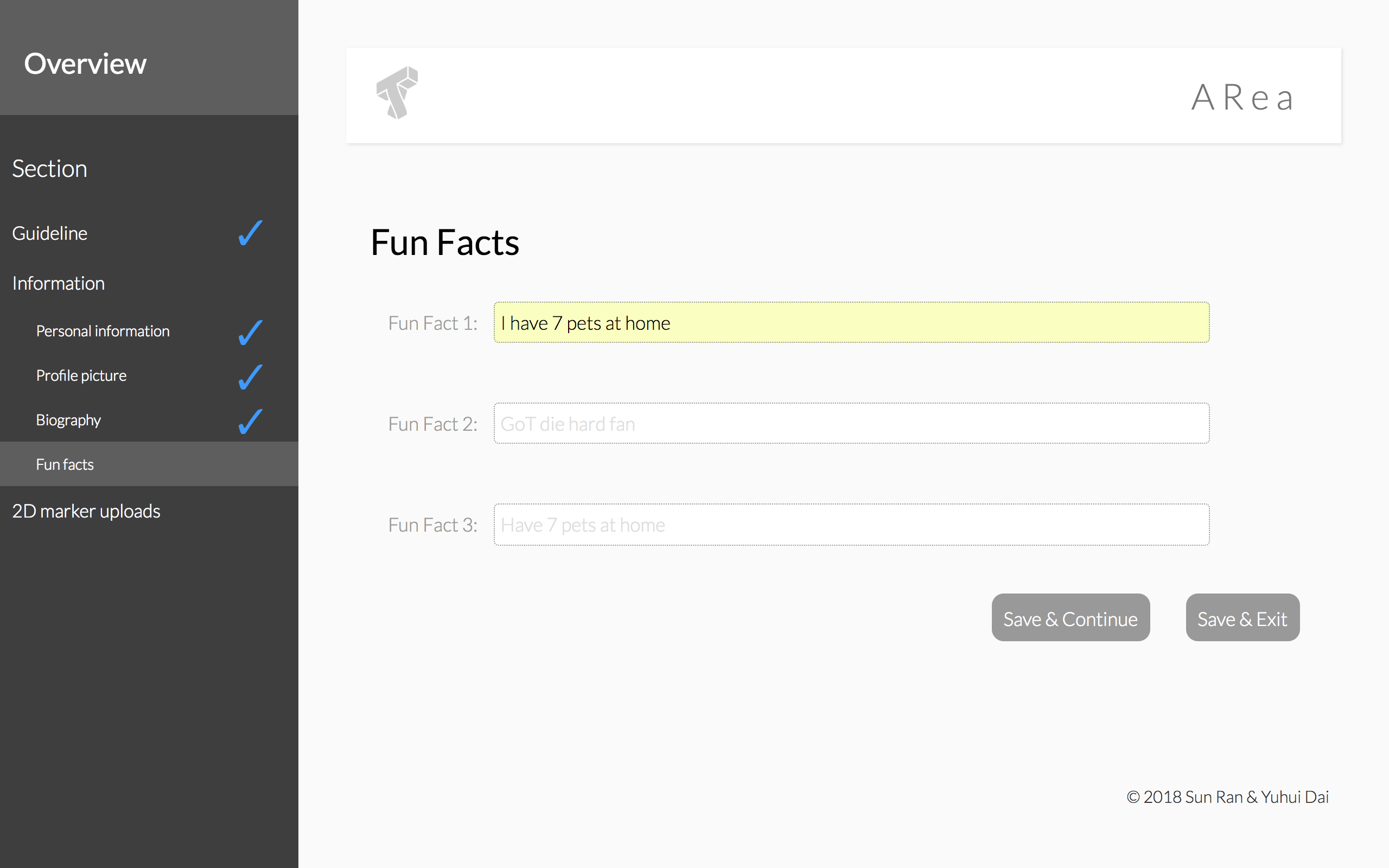
A core design of ARea is to collect personal and professional information from our target users. The information is displayed on the mobile side of the application. We built a complete website that collects information and the current interfaces are listed in the appendix. The website’s back-end is built in node.js and front-end with javascript, css, html, interfacing with mongo DB . It consists of a simple login system and several pages (step by step) asking for user information such as photo uploads, biography, etc. In order to test whether the website is intuitive and user friendly, we conducted user research with 12 people, who offered incredible insights.
User Testing Outcome and Future Improvements
We have a few design suggestions from our users, that are valuable to guide our next steps.
1. Add more visual cues to help users understand why we need this piece of information. For instance, we can design a correspondence visualization of how a specific piece of information will appear on the mobile interface, or even how users can interact with the information. This transformation will not only emphasize on the importance of gathering specific information but also help users understand how they can use the mobile AR app.
2. Add visual indications of optional and required information. Currently, the interface does not distinguish them in the UI, so that users would be annoyed when they realized they cannot go to next page when they haven’t filled out some information.
3. Allow users to provide more data about themselves (such as online portfolios, social media information). Although not everyone wants to share as much as they can about themselves, some people prefer to add more information. The current system does not allow this functionality. Since we use a No-SQL database, we could take advantage of its schema flexibility nature. Adding this functionality should not be challenging.
4. Display entered information when users revisit or re-login the website. This is helpful to remind them what they have filled in previously, so when they want to change information, they have a frame of reference.
5. Modify tones and languages to be more relaxing, playful and encouraging. The current tones and languages are a bit too formal. Changing the wording of some questions or descriptions can make the overall user experience smoother.
6. Horizontal indication of steps instead of vertical design (current). A horizontal visualization is generally preferred by the users we did testing on. They suggest that that design would be more intuitive.